The reason for the second review was very simple. Recently, PODOON staff telephoned me to ask about the use of my insoles, and told me that they have been trying to update the application of the insole. I said that it was very good. Then they said that the performance of the insole is now quite different from when I wrote the first article. I hope that I delete the original article there, and the impact is not good. At first glance, of course, my heart is not satisfied, but fortunately fortunately for a long time the article can be deleted? I answered yes, I can re-test the insole, the first article is still retained. PODOON also feels no problem, then there is this article.
Paste the previous assessment article, we can compare each item
 PODOON Running Smart Insole Evaluation Preface: In fact, I have been waiting for the emergence of smart insoles. For myself, or for running enthusiasts, the landing time, posture detection, and left and right foot functions of the Garmin 630 are all Very heart-watering. Inadequate wallet, it is pinned on the smart insole above, recently saw this smart insole, plus the price of 199, without hesitation on the pit to buy this insoles, looking forward to the function of Garmin 630. Text: First talk about how I jianjian_li | Like 5 Comments 19 Collection 22View details
 Well, I started to re-experience the feel of the insole after updating the software and firmware (I didn't feel like I had thrown away in the corner to eat it).
This assessment I mainly stand in the perspective of a runner to experience feelings.
Using the insole, the first is the connection of the insole. I have used it several times recently. The insole connection is still very fast. The main interface is reflected after a few steps.
The main interface is shown in Figure:
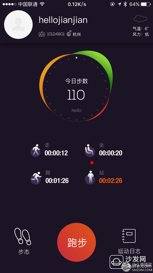
For the overall UI layout of the main interface and the information display situation, my personal assessment is that there are more than enough shortcomings. More than passed, but not excellent. For example, in the middle of the red running button, the feeling is in the main interface of living sticky, this button is still a few years ago app style, of course, I also understand the developer's intentions, the intention is that this button is the most commonly used to engage in Conspicuous point. Other interactive information icons, in addition to the main interface of the running button, you guess what can be pressed?
The following begins to experience the functions of the app, mainly 3 items, gait, running, and log.
First experience the gait, the main interface of gait as shown in the figure:
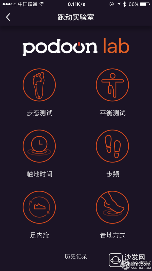
Can experience projects such as interface display (I suddenly wrote when I thought this button in the interface design style is very good, why the main interface running button does not use this style)
This is worth commending when compared to my first assessment. (This is my first assessment.) It shows that this company has not stopped developing new features after the release of the next generation of products. This attitude Worthy of praise, but also in front of the customer service to explain to me is the same, but the attitude is the attitude, the product is the product, the product in the end how, have to use to know.
Gait testing
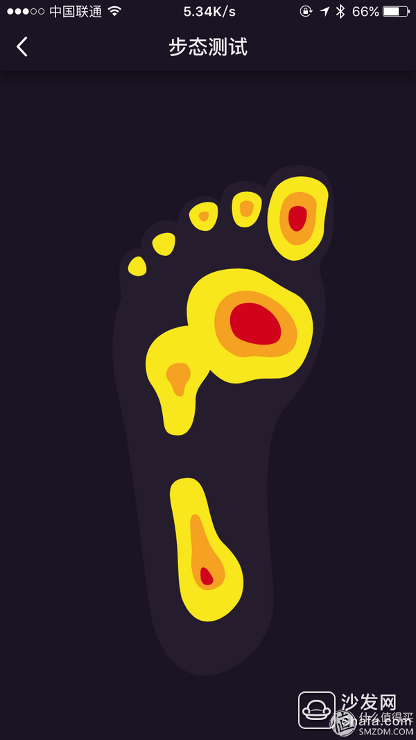
This is the product's newly added function. The essence is the pressure map of the sole. About 1 second refresh the feeling of pressure, a fun feature.
My comment is: This is a very potential feature. If this pressure feels that the refresh rate is faster (such as 10 times in 1 second), then this data can be stored and does not need to be stored for too long. It only needs to store 1 minute or 30 minutes. Second, let the runner run for 30 seconds or 1 minute in the normal position, then you can analyze the runner's pressure feeling on the running foot, and compare the excellent athlete's foot running reference value to know how to improve his running. If you have this feature, then NB is big, at least for now there is no such consumer-level products. Of course, this may not be possible due to hardware reasons. Come on, juvenile.
Balance test
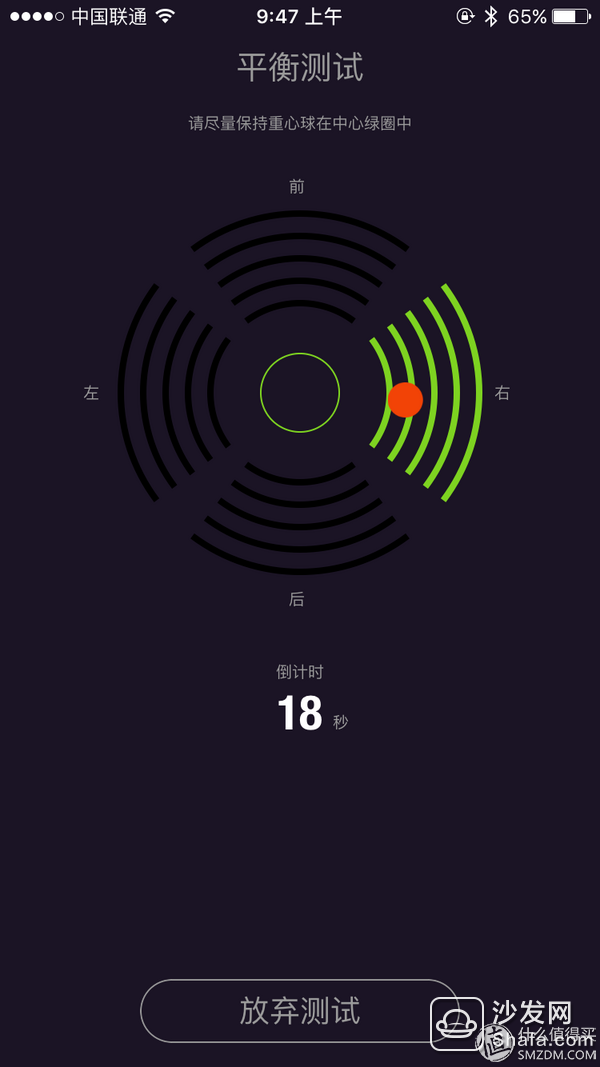
In fact, a derivative version of the sole pressure map. It is also a new feature of the back product. My evaluation is a fun feature, but it feels useless.
Touchdown time
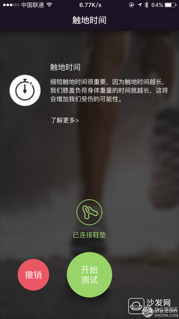

Compared with the first time, the screen is much more refined and the UI improvement is good. commendable.
Foot rotation
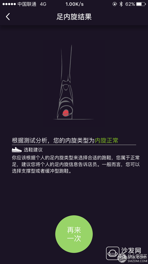
Landing way:
The test method is relatively simple. After starting the test, click on a few steps and then click on the end. This concludes the landing method from start to finish. The following is the result of my test:


Compared to the first time, this comprehensive information improvement is good, or rather, we just want information like this.
This time, compared to the first assessment, the BUG of the first Tucao was repaired (see my first assessment article). This is a plus for the user and is responsible for the user. The existing functions have also been optimized to a certain degree, and they are closer to the actual use situation, and some small functions have also been added. This is commendable. But in turn, think about some of the features here. For those who run, except for the first time they have fun, will these features be used?
Running function assessment:This should be the core function of the insole, which can comprehensively record the data of the insole during running and present it to the user.
The following is the main interface of the running function (I am not afraid of the shadow oblique, did not hide the specific seat information)
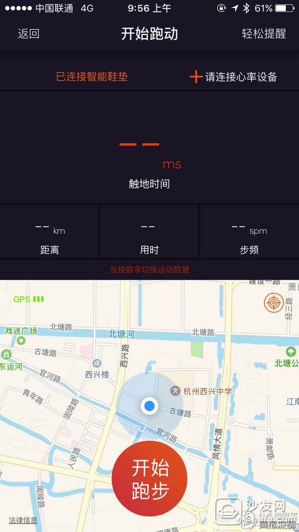
There is a hint that you can long press a piece of information to customize the information you need. All the data that can be replaced is as follows:

For most people, this information is enough. However, I personally recommend adding some running data, such as:
Instantaneous speed, average speed.
OK, to a specific running data map:
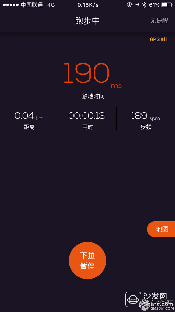
Compared with the first time, there was no change, but one thing I didn't feel humane enough during use was that the map button was too small. You need to know that the phone is shaking when running, and the hand is wet. The sensitivity of the touch screen is declining. The map button sometimes needs to be pressed several times to press. If it can be improved, it is hoped that it can be changed to a bigger one. In addition, it is suggested that the button that is paused and pulled down can be unlocked by a piece of area. The reason is also the same. During the running, the mobile phone is shaken, 1 is easily pressed, 2 is probably interrupted during the sliding process and needs to be pulled down again. One can refer to runtastic, I usually use this software, they do it more humane.
Below is the result of the previous run. (There is a reason why I used long-range screenshots.)

Compared to the somewhat cluttered data display in the first test, this time there has been some progress, but I still feel that the data display is messy, and the amount of information provided is wasted in the overall interface space usage. We can take a look at this long screenshot. In fact, the entire screen is swiped up and down, and the whole 2 pages are not displayed. When I pull to the bottom, the display is like this:
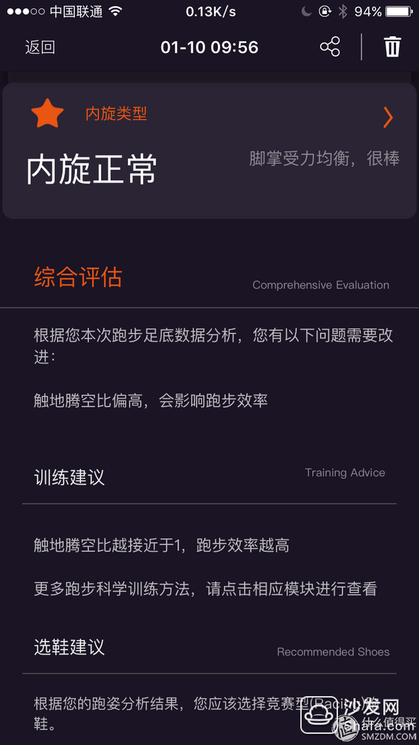
When I personally read this report, I selectively ignored nearly 4/5 of the content below the screen, because this information will not be noticed after I used it once. So my personal suggestion is to make a secondary menu with a comprehensive assessment and put it on the bottom of the screen. Users want to see it and see it. If you don’t want to see it, you don’t need to waste screen space. When I rolled the screen here, other data could not be displayed.
This problem also exists at the top of the page:
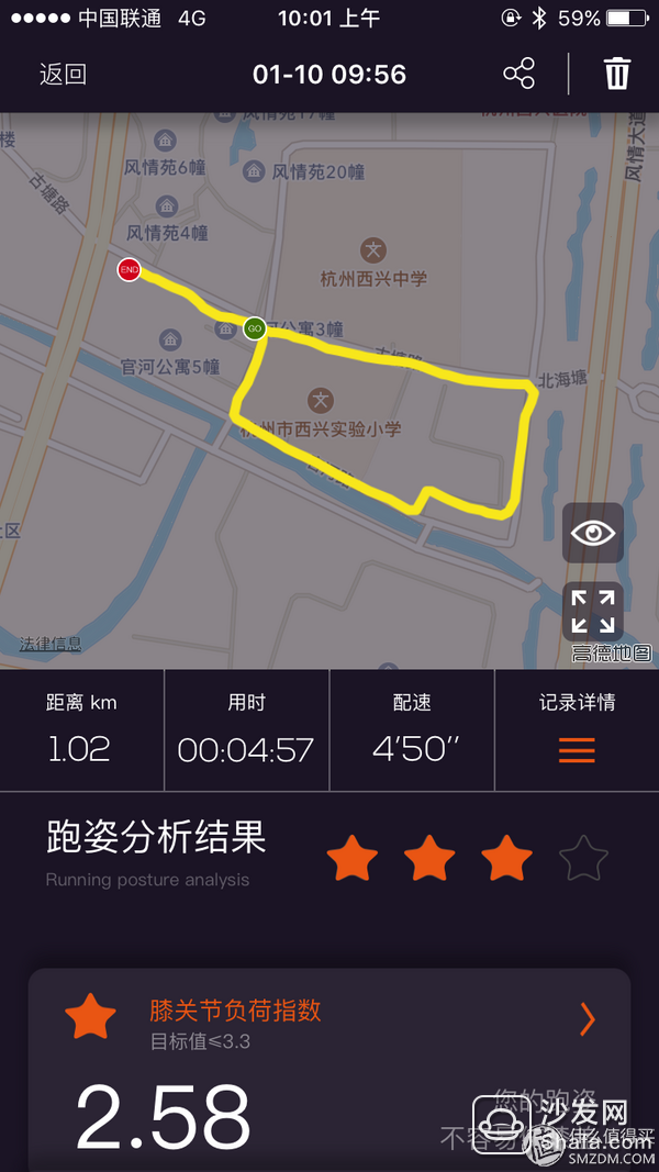
I have a question on this page:
Before I go down, can you tell me why there is a star missing from running 3 stars? Why can we show the knee load index but nothing else?
For comprehensive information evaluation:
I know that manufacturers want to display as much information as possible to the user, so that I have to use the long screenshot feature to show running information. However, when such a page is displayed in the end, it is important to lay out where each item is displayed.
I am also using Songtuo's stopwatch to see how they do it:
(Roll up and down 3 pages, basically the same as the overall information display of running software)
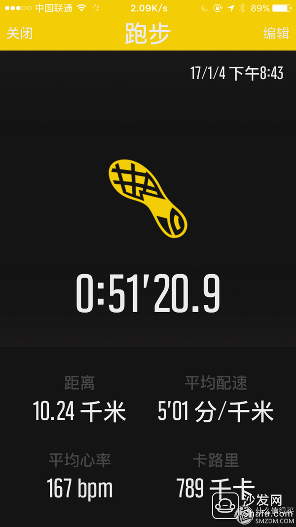
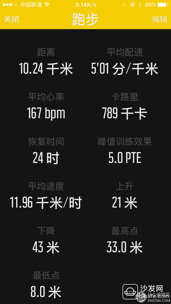
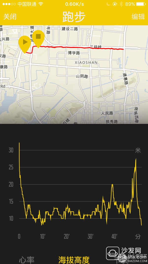
The first half shows the main information, the middle half shows all the specific data, and the second half shows the map information. With such a layout, everyone can feel the benefits.
Tucao so many deficiencies, the following is the need to praise
Take a look at the information displayed on the overall map interface: 
The information displayed on this map interface is clear and concise.
Knee index
In front of a knee index, point to the following information:
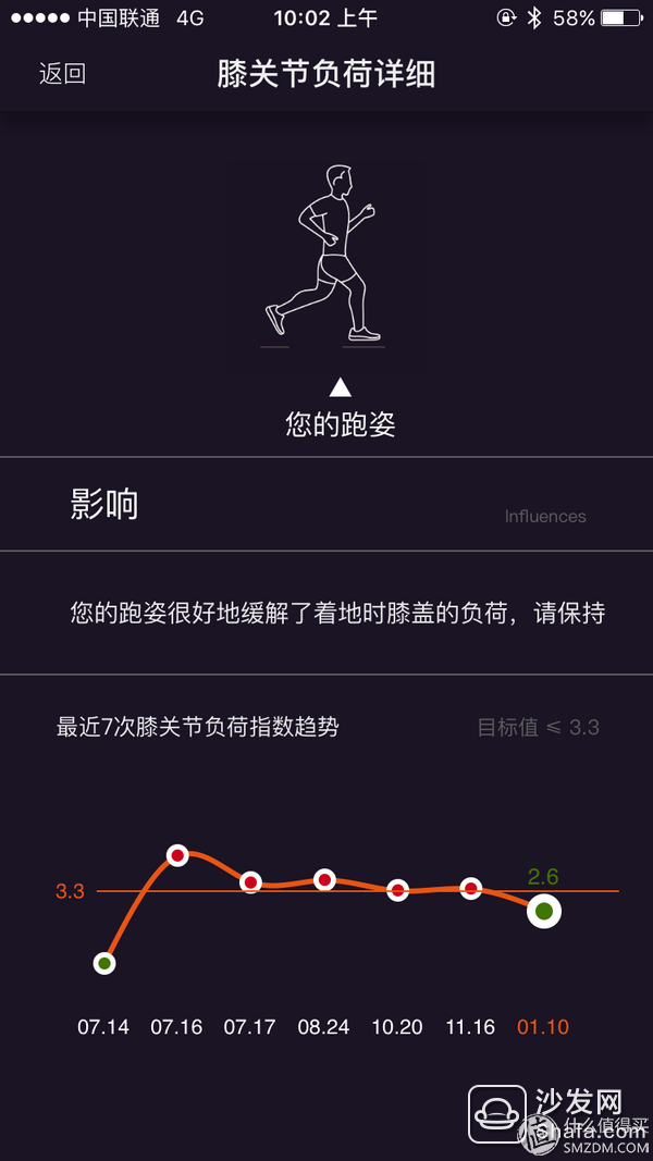
The historical record is displayed. It can be compared with the current record. The comparison is whether there is improvement or retrogression. It is helpful to the runners. At the time of my first evaluation, I proposed to say that these data are comparable. Meaning, not quite software actually realized in this way, plus points.
The second average pitch is similar to the one above, and it can also compare historical data. Not to say more.
The third bottoming out ratio, point in:
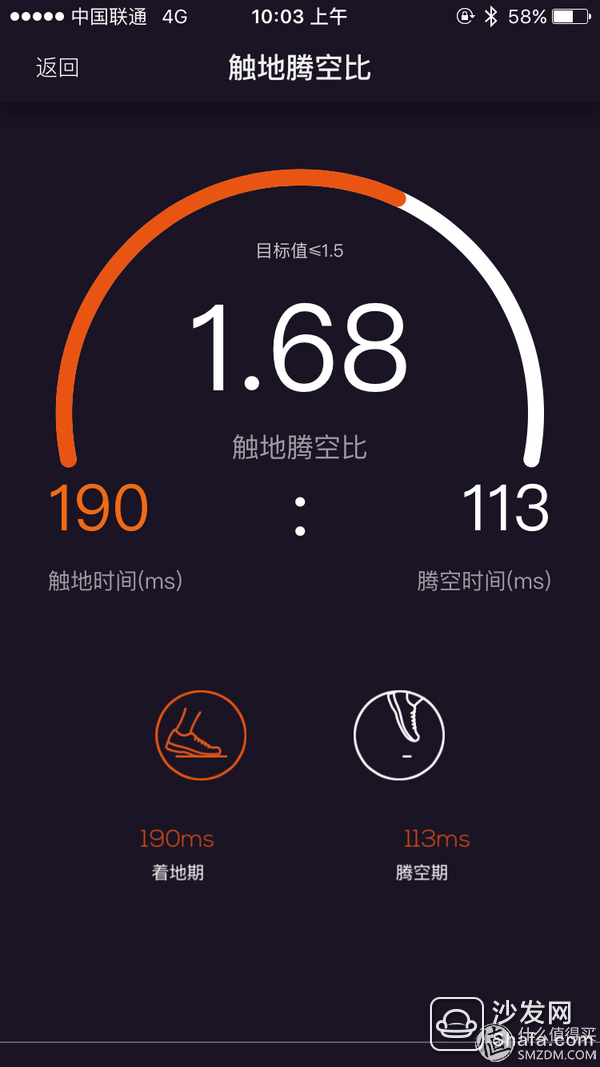
This is the data unique to the insole, and as before, after sliding down on this page, you can compare the history and the current data:
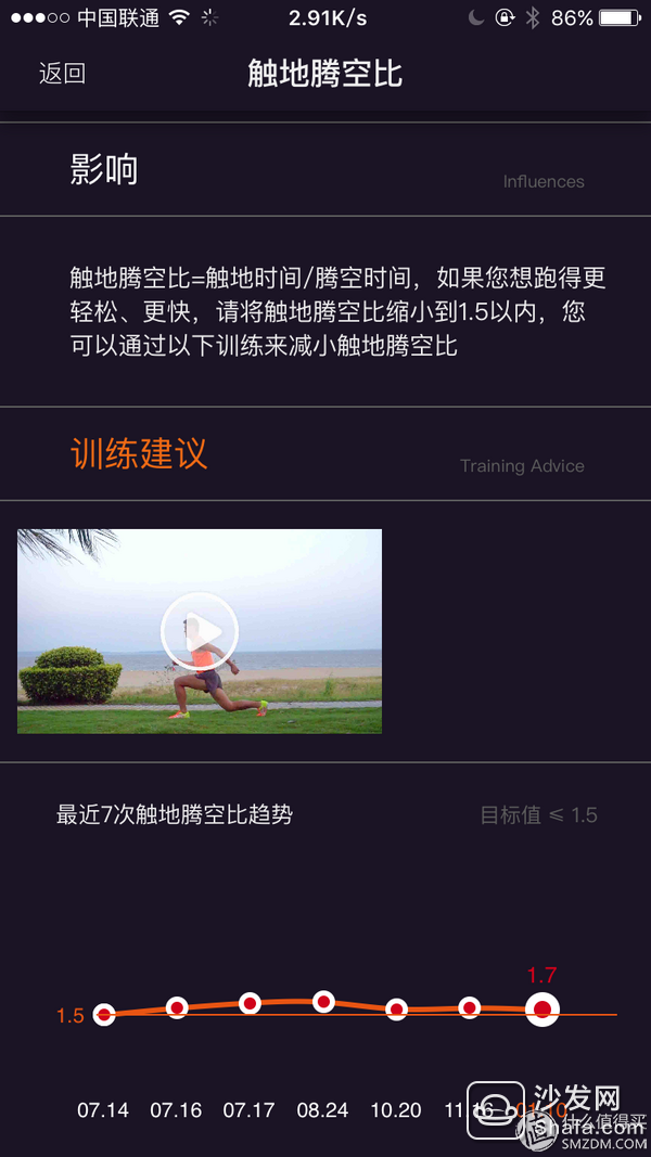
The personal proposal is that the most valuable information on this page is the comparison chart. Why is the most valuable information displayed at the very end?
Foot rotation:
No comparison information, no more information, in fact, do not need to look inside.
Although I had a lot of room for improvement on the above, I was still satisfied with the overall situation. Compared with the first evaluation, this time the product has progressed a lot. We can compare my first assessment of the article, see the then What kind of product is it? I think everyone will make judgments on their own.
Wrote it here and found it was early in the morning. Submit to sleep.
Aluminum Slip On Flange is a flange that connects steel pipes and pipe fittings into the flange and is connected to equipment or pipes through fillet welds. The mainly product is aluminum forged slip on flange, 1060 aluminum slip on flange, 6061 aluminum slip on flange, 5083 aluminum slip on flange, forged slip on flange, 1060T6 Aluminum Flange.
Our production scope: ASTM/ASME/ANSIB16.5, B16.47, ASME/ANSIB16.48 flange
Size: 1/2"-120" (DN15-DN3000)
Pressure: Class150-Class2500
Facing RF/FF / RTJ
Standard: ASTM/ASME/ANSIB16.5, ASME/ANSI B16.3and B16.47, ASME/ANSIB16.42, JIS/KS (5K, 10K, 16K, 20K), DIN2633, DIN2634, DIN2635,EN1092,BS4504,
Inspection: In house and third party
Document: MTC Comply with EN10204 3.1 can be provided prior to shipment
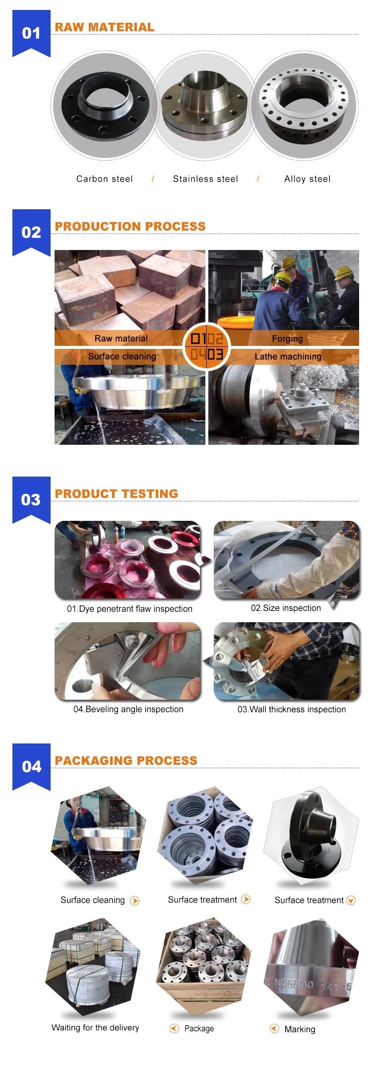
Aluminum Forged Slip On Flange,1060 Aluminum Slip On Flange,6061 Aluminum Slip On Flange,5083 Aluminum Slip On Flange,Forged Slip On Flange,1060T6 Aluminum Flange
HEBEI HANMAC MACHINE CO., LTD. , https://www.chinahanmac.com